Is Virtual Color Analysis Accurate? Here’s What I Learned

Let’s dive into a hot topic right now—virtual color analysis. If you’ve ever wandered into a Reddit thread debating seasons, tested a TikTok filter, or struggled to find solid advice online, you’re not alone.
Here’s the thing: I run an in-person color studio in Fort Collins, CO, where I help people discover their best colors face-to-face. But back in 2023, I decided to dip my toes into the virtual world to see if I could help clients from all over the globe.
Spoiler: it was a learning experience, to say the least. In this post, I’ll walk you through exactly what I tried, what worked (and what didn’t), and how I’d approach virtual color analysis if I ever decided to do it again. Trust me, I picked up some invaluable lessons along the way—and I’m here to share them with you. Let’s dive in!
Experiment 1: Virtual Color Consult with 1-2 Photo Submissions
At first, I thought I’d cracked the code! I hired a designer to create a program in Photoshop that could take someone’s photo and instantly apply 100+ hex code colors under their face to compare them. It seemed like the perfect solution for analyzing clients from all over the world! I was golden!
But reality hit fast. This method had so many limitations—where do I even begin?
The biggest issue? It completely removed the real-time, dynamic process of color analysis. In person, I can observe the subtle shifts that happen as different fabric colors interact with someone’s undertone (the second layer of the skin). But with a static photo, I couldn’t see whether a color truly balanced and harmonized with their features or if it created shadows, blotchiness, or dullness.

Another major flaw? I was assessing colors against the overtone of the skin (the outermost layer), which doesn’t tell the whole story. Many people—especially people of color—may have a warm-looking overtone, but their actual undertones can be cool. And that’s one of the biggest reasons I see people placed in the wrong season!
I quickly realized this wasn’t true color analysis, and I couldn’t keep using it in good conscience. The thought of putting someone in the wrong season based on incomplete information honestly kept me up at night.
If you’ve ever used a filter or had a virtual color analysis based on just 1-2 photos, you know it can feel like a fun, accessible, budget-friendly way to find your season. And sure, sometimes they absolutely might get it right—but more often than not, it’s just a total guessing game. They’ll likely highlight their method in their marketing, explaining how they use hundreds of hex color comparisons to determine your season.
While that sounds precise, the reality is that it’s incredibly difficult to get an accurate result from a static photo alone.
Real color analysis is about seeing the subtle, real-time shifts on your skin and personal coloring when different fabrics are draped under your face. That’s the magic moment when you know a color is working.
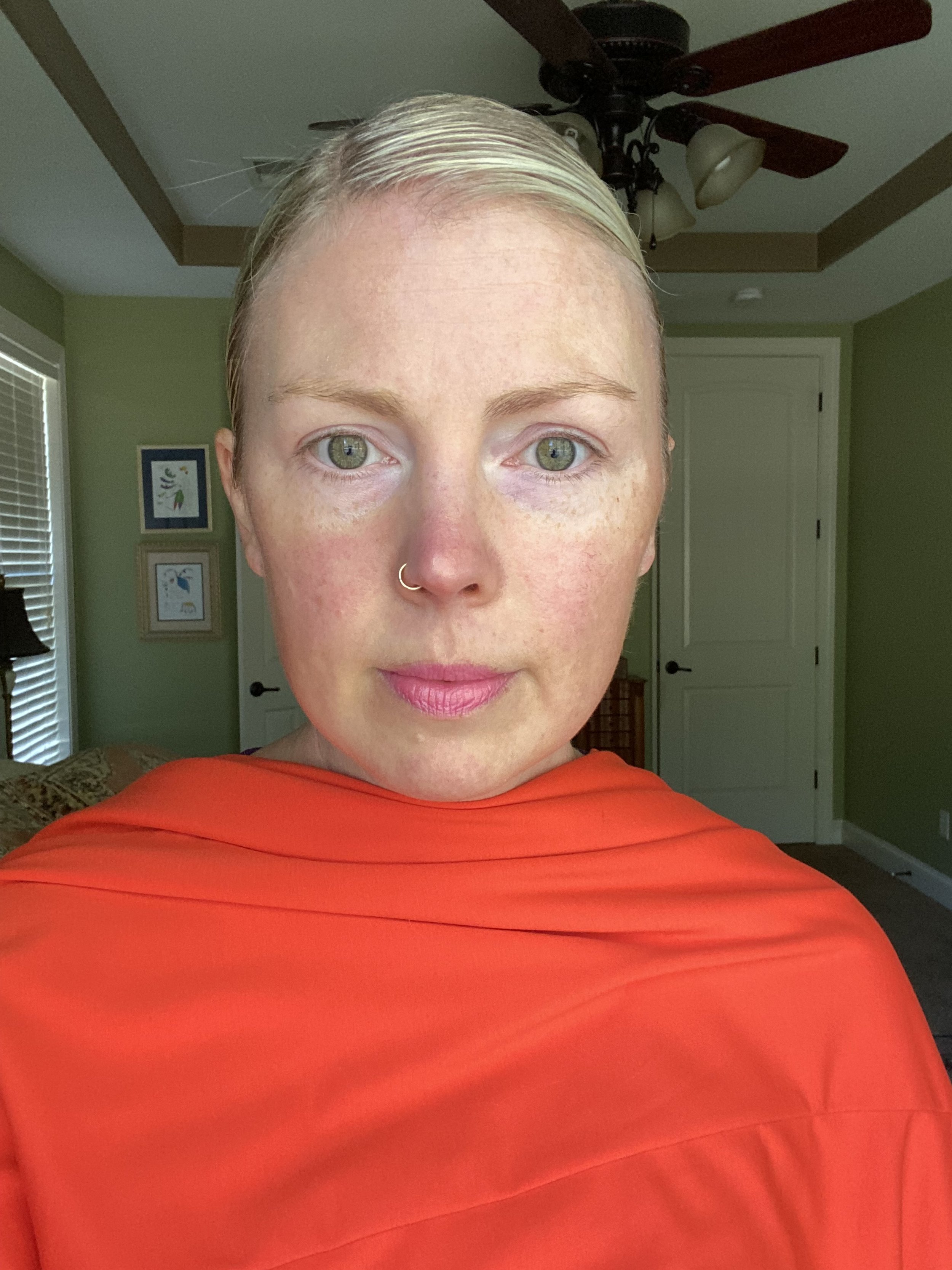
Here’s an example of how I swapped drape colors in Photoshop:


Experiment 2: Virtual Color Consult with 50-60 Photos Using Clothing from Clients’ Closets
Next, I tried a different approach. I asked my virtual clients to use clothing from their own closets and take photos in natural light, with their hair pulled back if it was dyed. This method worked much better! Several companies use similar techniques, and for good reason—it allows you to start identifying patterns in how colors interact with someone’s skin.


By organizing the photos into the 12 seasons, I could begin to analyze how the colors affected each client’s appearance. I’d ask myself:
Does the color even out their skin tone or make it blotchy?
Does it brighten their eyes or create shadows under them?
Does it feel in balance with them or completely overpower them?
This method felt much closer to the in-studio experience, where I can see these transformations happen in real time.
While it wasn’t perfect, it brought me closer to the accuracy I strive for when matching clients to their best colors.

The Challenge with This Approach
While this approach was more accurate, it came with a significant challenge: relying on clients to have access to a wide range of colors in their closet. In reality, most people don’t have enough variation in their wardrobe to provide all the data needed for a truly precise analysis. For example, if my Warm Spring clients struggle to find their colors in stores, it's even less likely that people already have those shades in their closets.
Because of this, I often asked clients to visit thrift stores to find additional colors and snap selfies by the store window. I know, it sounds a little wild! 😅 I’d send them a specific color list and ask them to take photos with these fabrics. While this back-and-forth method worked and helped ensure accuracy, it was incredibly time-consuming.
In my studio, I have an extensive collection of drapes, which allows me to confidently identify someone’s season in under 20 minutes. Compare that to the hours or days spent coordinating virtually, and the decision became clear: my time was better spent focusing on my local clients and growing my business through in-person consultations. Honestly, I love meeting with so many different people face-to-face!
Key Takeaways for Color Analysis Enthusiasts
If you’re as passionate about color analysis as I am, here’s what you should know:
Single-Photo Virtual Analysis Is Unreliable
Virtual color analysis that relies on just 1-2 photos is far from accurate. It only compares colors to your overtone (the outermost layer of your skin), which doesn’t tell the whole story. Again, many of my POC clients have warm overtones but cool undertones—a key nuance that’s often missed in virtual analysis.Multiple Photos and Colors Are Essential
For virtual analysis to even come close to accurate, you need a variety of photos (50–60 is ideal) and a WIDE range of colors. Take the time to pull as many colors as possible from your wardrobe, or better yet, head to a thrift store to expand your options. The extra effort pays off in the end!Fabric Sets Are a Game-Changer
Some color companies ship fabric sets directly to clients, which is a brilliant solution. These sets give you a controlled range of colors to test, helping narrow things down with much greater accuracy.
With these tips, you can approach virtual color analysis more thoughtfully and with better results.
PS. What do you think about these approaches? Let me know in the comments—I’d love to hear your thoughts! 💫
About the Author:

Hello, I’m Megan Haynes, a professional color analyst with over six years of experience and more than 600 clients. My passion? Helping people discover their best colors so they can look and feel their absolute best—every single day.
Beyond in-person color analysis, my husband Derek and I are the duo behind Colorbook’s Shop by 12 Seasons, the first real-time shopping experience tailored to seasonal color palettes. You’ll often find us at our dining room table—him coding, me curating seasonal pieces—working to make color analysis even more accessible.
Thinking about traveling to Colorado for a color analysis? Check out my guide on how to get to my Fort Collins studio!