Bright | Clear Spring: The Complete Guide
The Bright Spring color palette is all about vibrant, warm, and energetic tones that radiate joyful energy. These clear, fresh colors perfectly complement those with striking, bright personal coloring. Ready to unlock the magic of your palette? Dive into this complete guide packed with Bright Spring outfit ideas, makeup tips, hair inspiration, denim suggestions, jewelry picks, and so much more!
Are you a Bright Spring?
To determine if you are a Bright Spring, observe the following characteristics when you look in the mirror:
High Contrast: There is a noticeable contrast between your hair, eyes, and skin tone. Or you have an overall brightness with your coloring!
Hair: Black, deep brown, medium brown, red
Skin: Warm/Neutral undertones
Eyes: dark brown, ebony, hazel, olive, bright blue, bright green
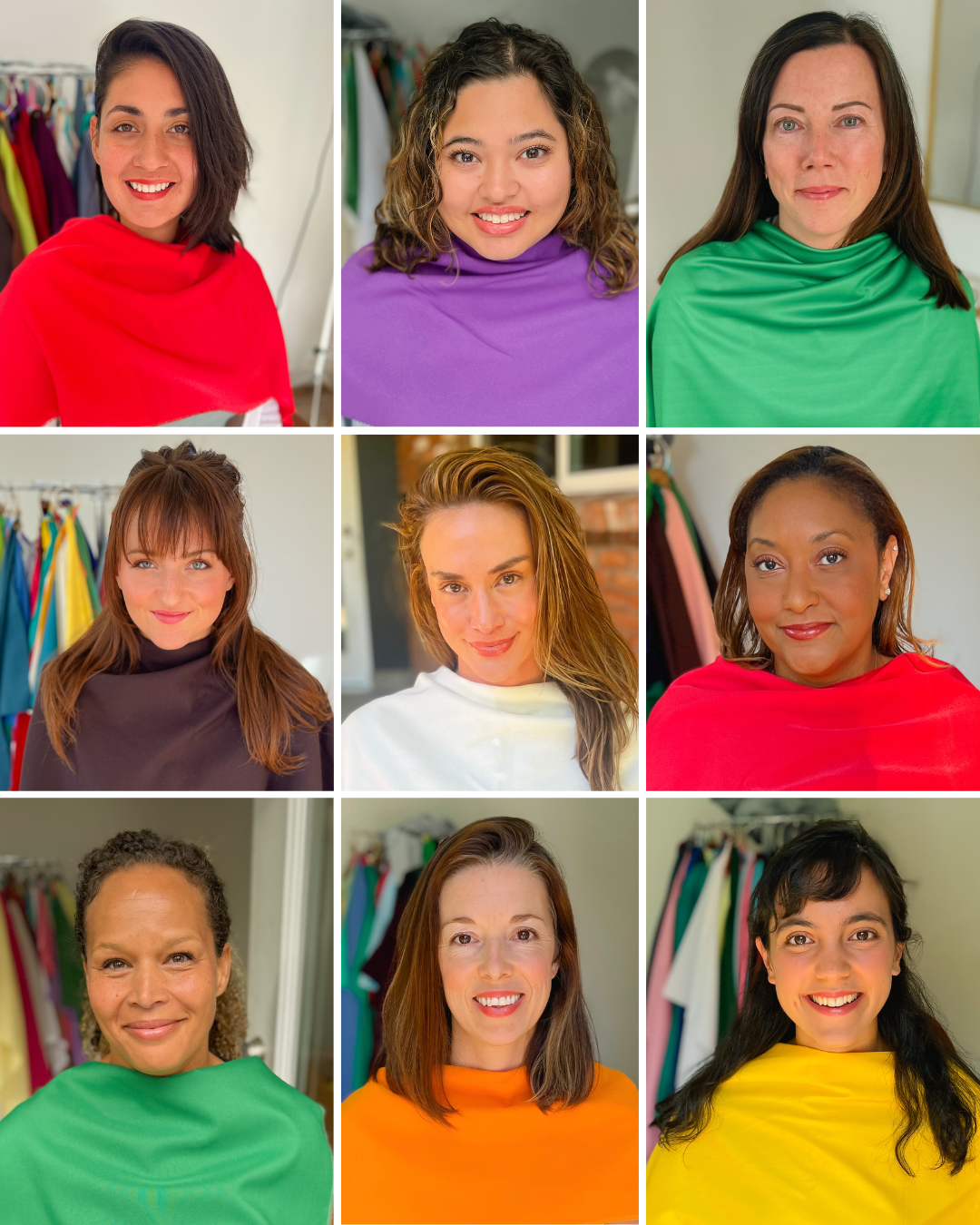
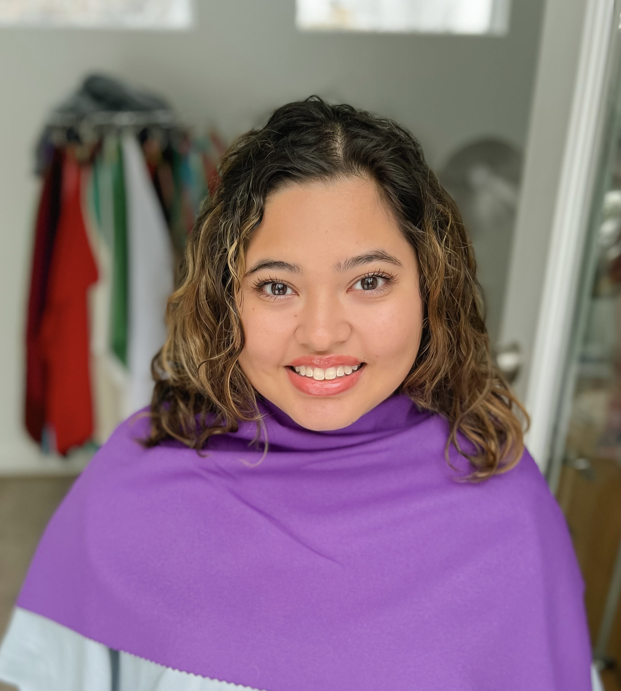
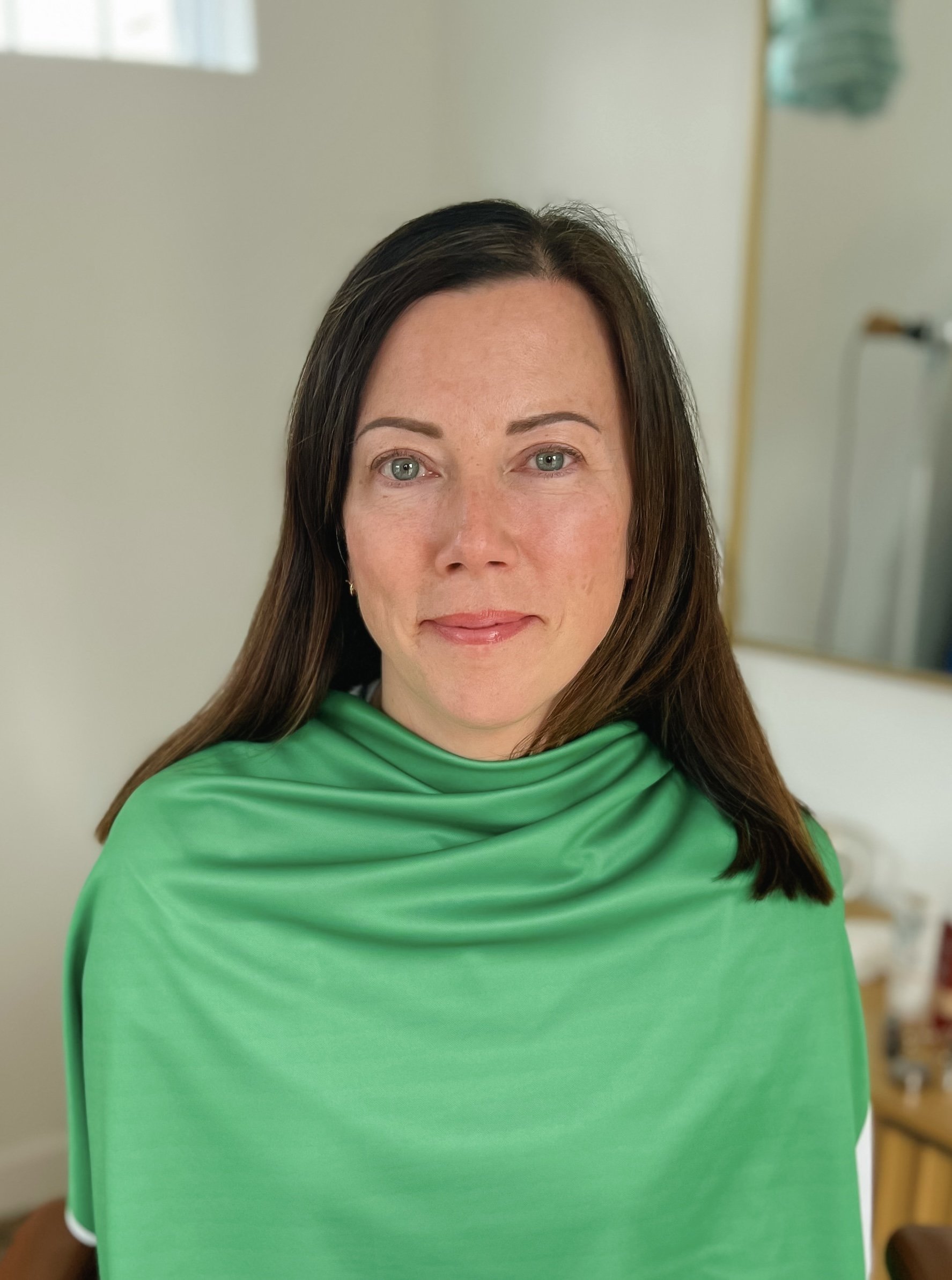
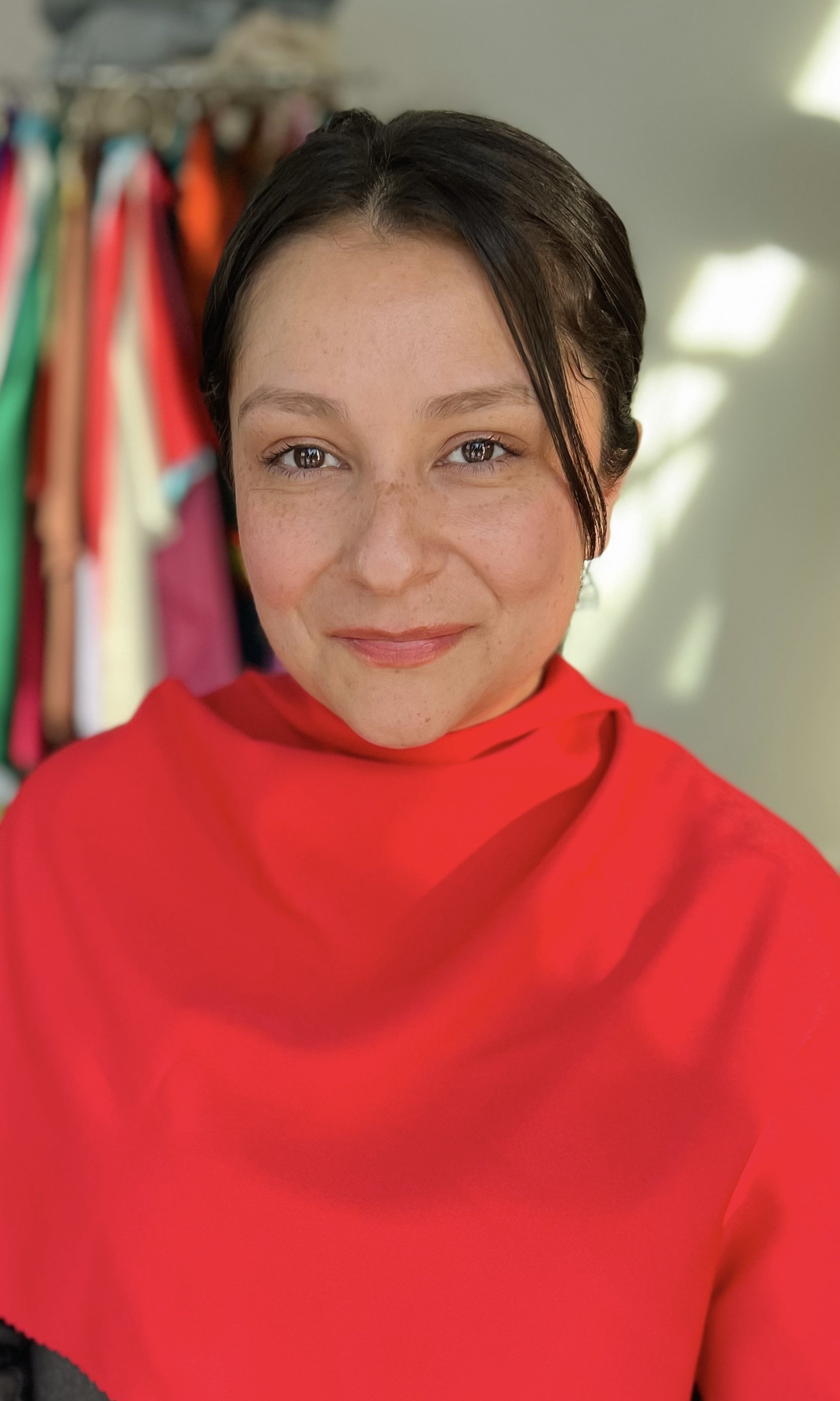
Bright Spring Examples
Here’s a selection of Bright Spring examples with their natural hair color from my in-person color analysis consultations.


Were you analyzed correctly?
To ensure you were correctly identified as a Bright Spring, here are some helpful tips to verify your results.
Photo Comparison: Do you resemble the Bright Spring clients in the photos above and the description?
Gold & Silver: Bright Springs shine in both gold and silver, but gold often feels especially harmonious.
Compliments: Do you light up in vibrant, clear colors and receive compliments when wearing them?
Comparing Colors: Do Bright Winter colors feel a bit too cool on you? Do Warm Spring colors lack the vibrancy you need? That’s a strong clue you could be a Bright Spring!
Bright Spring colors are the vibrant, fresh hues of a sunlit spring day—think sunny yellows, clear corals, bright turquoise, and warm apple greens. These shades are bold, warm, and full of life, perfectly complementing the radiant, sparkling features of a Bright Spring complexion.
Want a free Bright Spring color palette to save to your phone? Click here! ✨

Bright Spring colors have these characteristics:
Hue: Bright Spring’s colors are clear, vibrant, and warm, with a sunny energy that feels fresh and inviting. There’s no heaviness or dullness—just pure, joyful brightness that enhances a Bright Spring’s features.
Value: Bright Spring’s palette spans a range of values, from lively mid-tones like coral and bright turquoise to light, airy shades like lemon yellow and warm ivory. This mix creates the uplifting and energetic look that defines the season.
Chroma: Bright Spring’s colors are highly saturated and full of life. They are vivid, bold, and unapologetically radiant, creating a look that is warm, dynamic, and bursting with energy.
Bright Winter and Bright Spring both share vibrant, high-energy tones, but their key difference lies in their undertones—cool for Bright Winter and warm for Bright Spring.
Bright Spring: Bright Spring shares the vibrancy of Bright Winter but leans toward warmer, sunnier tones.
Bright Winter: This palette is all about bold, electric colors with a distinctly cool undertone. Think icy blues, electric magentas, and crisp whites.

While both seasons embrace warmth and vitality, Bright Spring is all about bold, high-energy brilliance, while Warm Spring offers a golden, lighter glow.
Bright Spring: This palette is all about clear, high-energy colors that radiate warmth and vibrancy.
Warm Spring: While equally warm, Warm Spring shifts towards lighter, more golden tones. Picture hues like peach, goldenrod, and apricot. Warm Spring’s palette feels grounded and inviting, with a touch of warmth that’s lighter.

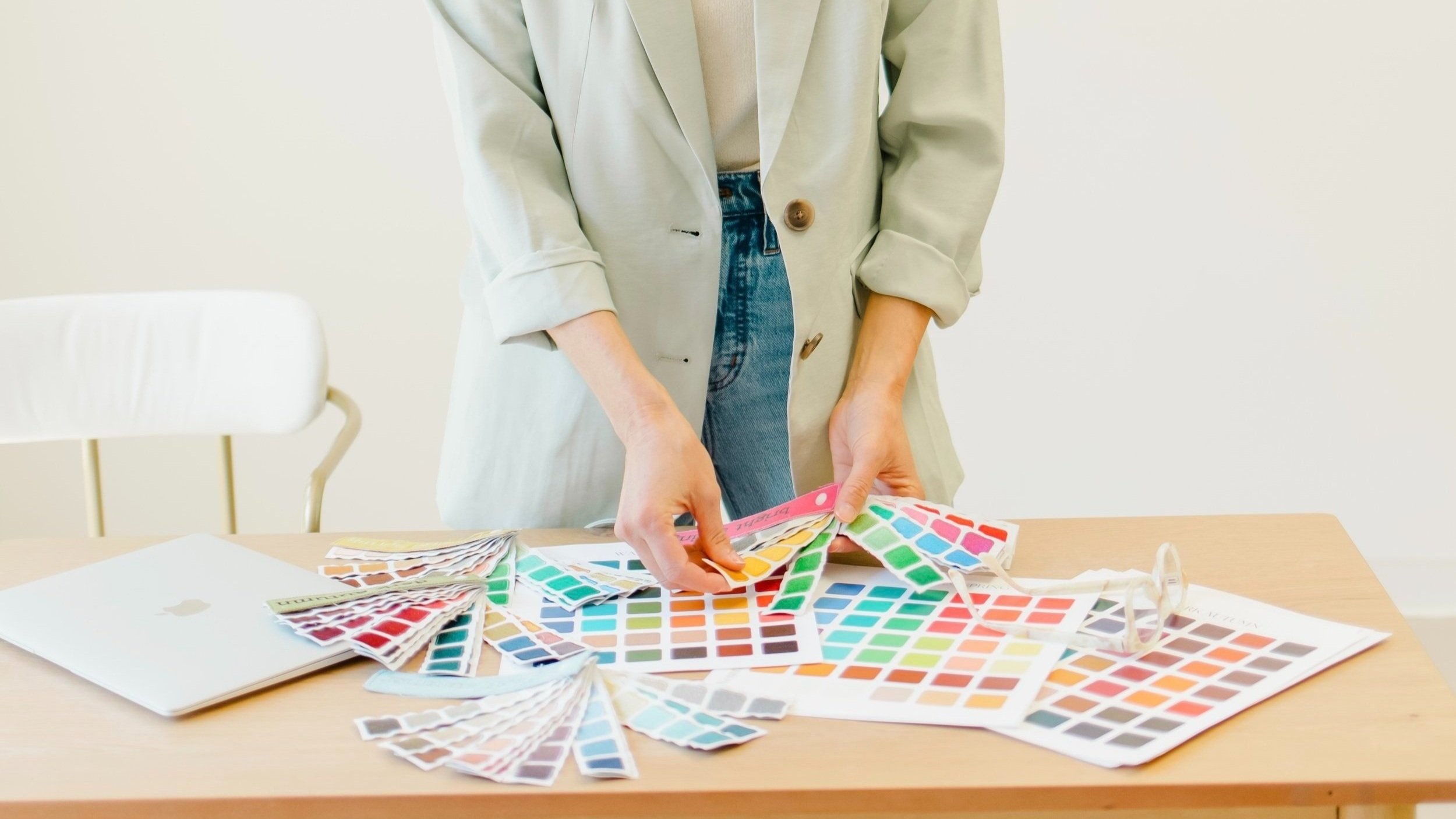
Discovered you’re a Bright Spring and ready to shop?
Colorbook offers a unique real-time shopping experience tailored to your color season and style. Enjoy a fun and easy way to create your perfect Bright Spring wardrobe!


Beautiful neutrals
The perfect neutral colors for a Bright Spring palette include warm ivory, cream, chocolate brown, charcoal, and bright navy. These shades complement your vibrant, warm undertones while maintaining the clarity and brightness of your palette.
Neutrals to avoid
Bright Springs should avoid overly cool or muted, soft neutrals, as they can clash with your warm, radiant coloring.
Choose bright and clear denim
For Bright Springs, look for medium to darker denim with a clear, saturated, bright vibe.
Avoid faded denim
Faded or overly muted denim can dull the brightness of a Bright Spring palette. Instead, opt for clean, saturated washes that maintain the fresh, lively feel of your season.
Here are some stylish ways to showcase your color palette while keeping your look natural and balanced:
Neutral + accent
Pair one of your warm neutrals, like ivory or chocolate brown, with a bright accent color. For example, match ivory with fresh coral for a cheerful, balanced look.
Denim + color
Choose denim and match it with any of your bright spring colors.
Playful contrast
Combine one of your bold colors with a lighter, bright shade for a lively contrast. For instance, pair a sunny yellow top with a soft aqua cardigan for a dynamic, bold look.
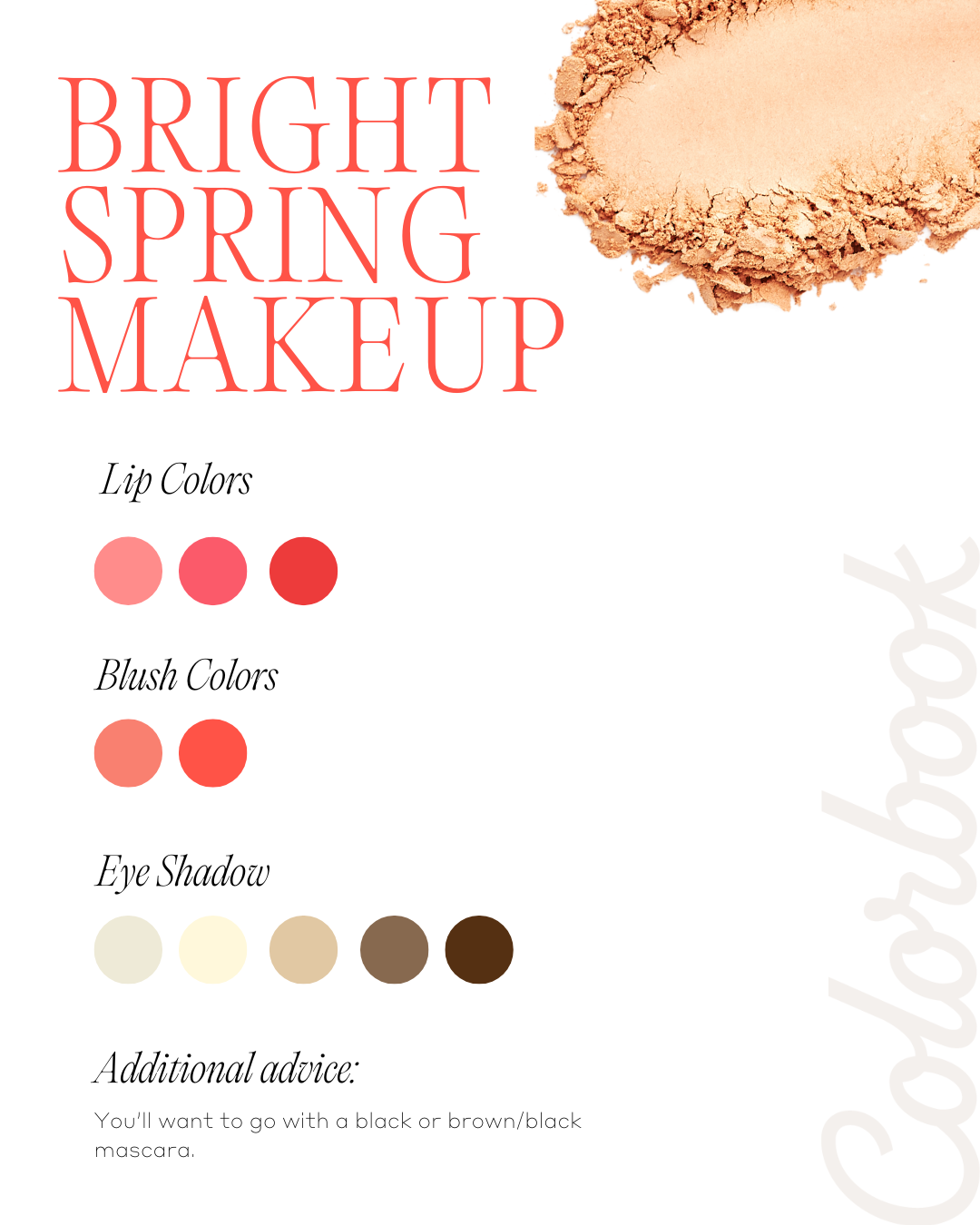
Bright Spring makeup is all about vibrant, warm hues that enhance your radiant energy. Think shades like coral, peachy pink, bright watermelon, golden apricot, or a warm red. Click here for a complete list of Bright Spring makeup recommendations, including blush, lipstick, eyeshadows, and mascara to perfectly complement your coloring!
Here’s a guide to help you choose the best metals, stones, and other accessories to complement your Bright Spring palette.
Metals & Jewelry
For Bright Spring, warm and reflective metals are your best match. Gold, copper, and bronze enhance the sunny and vibrant tones of your palette, adding warmth and glow. Pewter and shiny silver can also work beautifully, especially when paired with your brighter colors.
Stones
Bright Spring accessories shine with vibrant, clear, and lively gemstones. Ideal options include turquoise, jade, coral, peridot, citrine, aquamarine, ivory pearls, emerald, and sapphire. These striking stones bring energy and brilliance to your palette, perfectly complementing its playful and radiant vibe.
Other Ideas
Bright Spring is about vibrancy and lightness, so opt for accessories with glossy finishes, playful designs, and bold pops of color.
Since Bright Spring’s primary color characteristics are clear, vibrant, and warm, the least flattering colors for you are overly muted or cool tones.
Muted | Cool Colors:
Muted, cool shades like dusty grays, icy blues, or ashy browns can dull your natural radiance and may leave you looking less vibrant and refreshed.

Here’s the hair advice I share with my Bright Spring clients, along with examples of their natural hair below.
Embrace Your Natural Color
Your natural hair color is perfectly suited to your Bright Spring palette! Embrace its natural beauty as it will harmonize beautifully with your colors.
Opt for Warm Hues
For your hair color, it’s best to choose a dye that matches your natural shade exactly, avoiding highlights that can wash you out.


When adding patterns and prints to your Bright Spring wardrobe, consider these tips to ensure they complement your natural coloring:
Suggested Patterns
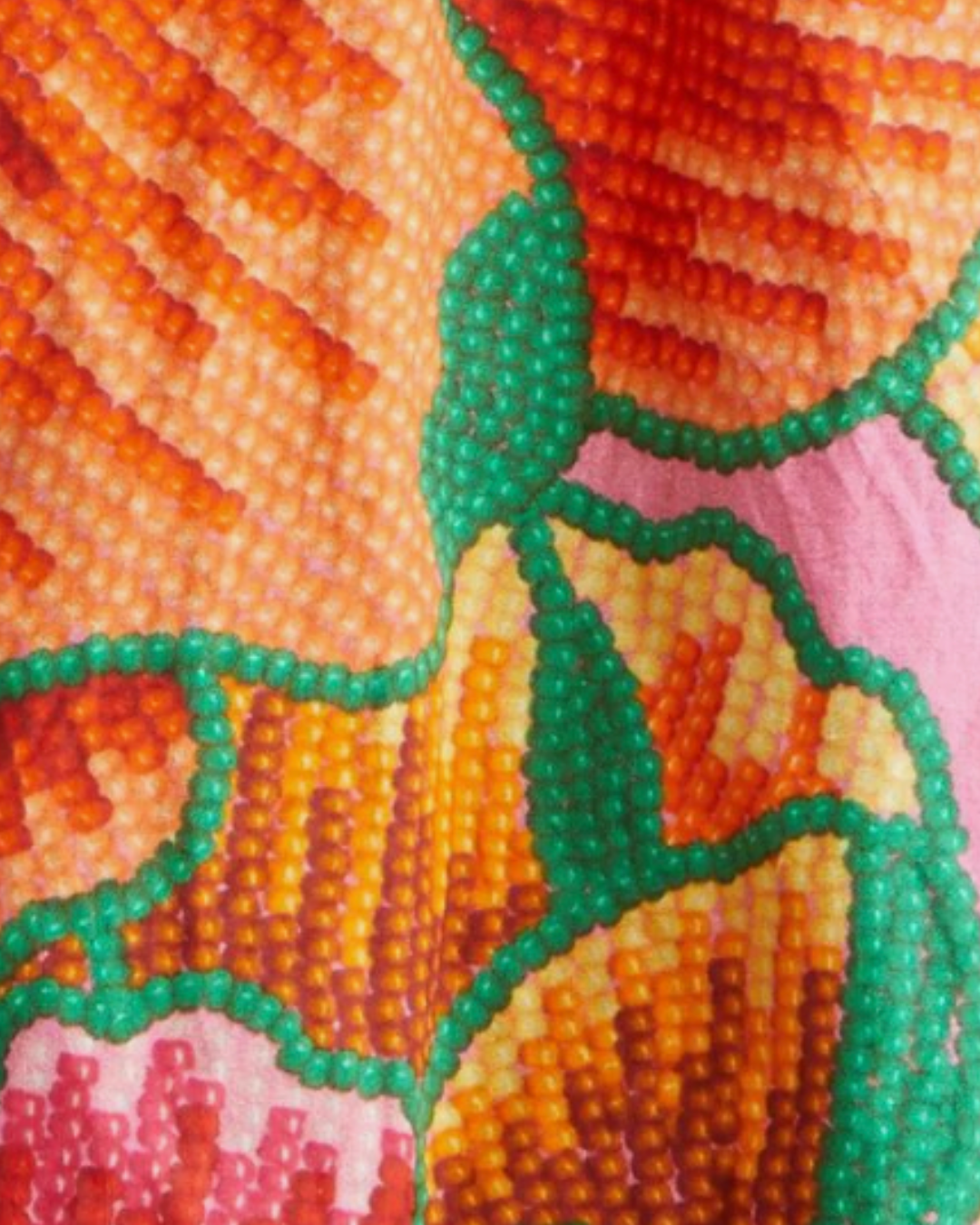
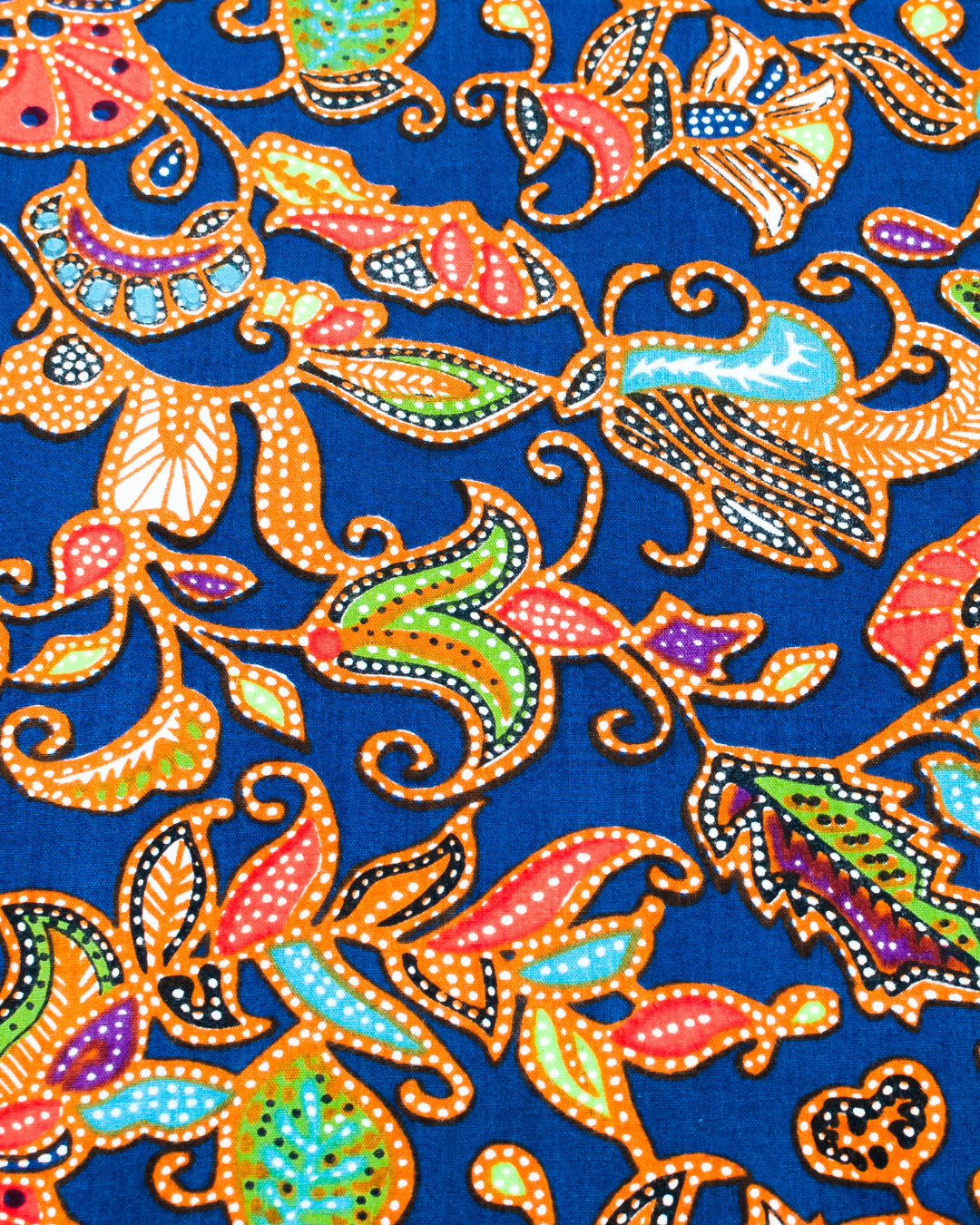
Choose patterns that prominently feature Bright Spring colors, focusing on vibrant, tropical, and sunshine colors.
Look for patterns with a significant intensity to match your color palette.
Patterns to Avoid
Avoid muted and cool patterns as they can clash with your warm, golden coloring.

Join the list!
Get curated color inspiration, seasonal lookbooks, and expert tips sent straight to your inbox. Sign up for our free newsletter and start feeling inspired today!